Investors who have ventured into cryptocurrencies will quickly observe the rapid and frequent real-time updates of Bitcoin or crypto charts. Due to the asset’s infamous volatility, the erratic price fluctuations can be captivating, yet few can accurately interpret cryptocurrency charts. Moreover, even fewer possess the ability to comprehend cryptocurrency charts fully and make informed decisions based on their signals.
This guide will explain all of the various elements of a crypto price chart, along with an in-depth introduction to technical analysis. By the time you’re done reading the guide, you’ll know exactly how to read a crypto chart or how to read a Bitcoin chart in detail.
What Is A Crypto Chart?
A crypto chart is a snapshot of the historic and current price action taking place across a specific timeframe, ranging from seconds to minutes, days to weeks, and even months, years and more.
The price action itself is represented as a line, graph, area, bar charts, Japanese candlesticks, and more.
Crypto charts denote the trading pair, timeframe being looked at, and the trading platform in question. Charts also typically display each timeframe’s spot price open, high, low, and close. Dates and price increments are viable at the bottom and side. All of the above elements are represented in the Bitcoin chart example below.
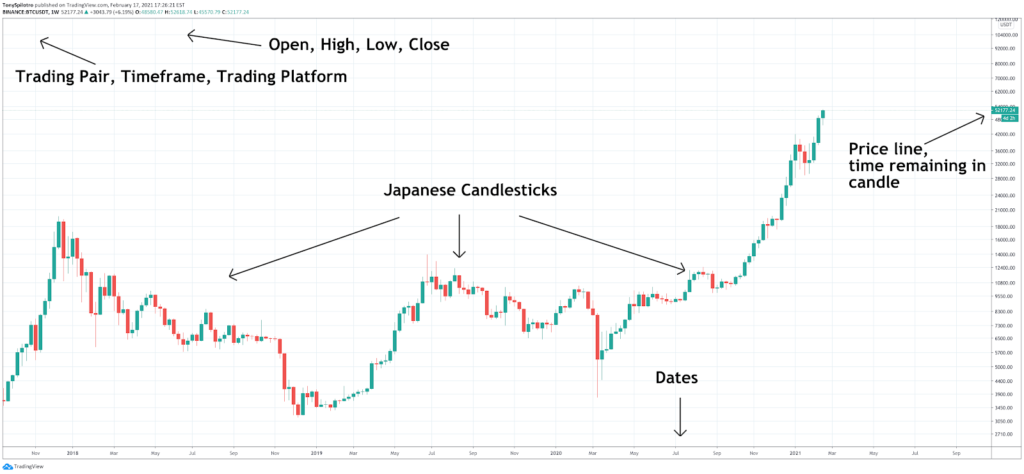
Depending on the chart, technical indicators such as volume or moving averages will appear below the cryptocurrency exchange price action and follow along with each trading session open and close.
Candlestick Chart
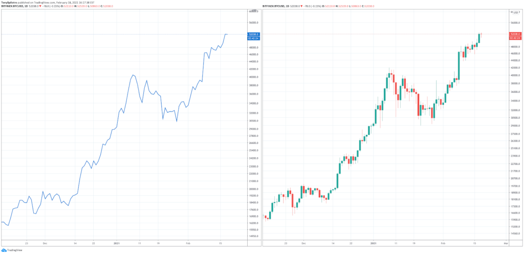
The Japanese candlestick chart (pictured on the right) is the second most common chart type next to a line chart.
Japanese candlesticks are usually preferred by analysts because of the additional information they can provide. For example, there is more to tell from each candle’s open, high, low, and close. If price action during the candle goes beyond the open or close, a shadow or candle “wick” is left behind.
The size, shape, length, and color of these candlesticks and the patterns they form can provide analysts, investors, and traders with clues about future price action, and can take positions or make adjustments based on probabilities.
Bullish Reversal Patterns
Japanese candlesticks can provide a lot of information in one single candle. However, when certain candles are combined in a specific sequence, it can be an accurate signal about the upcoming price action. Here are some of the most common and powerful bullish reversal signals.
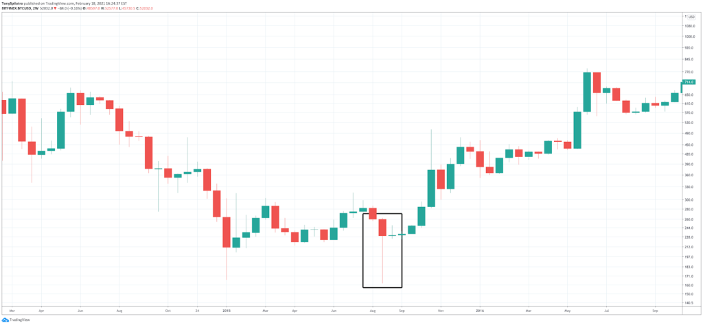
Hammer Candle Pattern
A “bullish hammer” is a reversal pattern that often takes place at the bottom of a downtrend. The long lower wick resembles a handle, while the full candle body represents the head of the hammer. Green hammers are stronger signals than red hammers, but as the example of Bitcoin’s bottom in 2015 shows, can still be strong in their own right.
This pattern shows a strong push down by bears that was met with and eventually overwhelmed buying strength. Follow through is required for the pattern to be valid.
Bullish Engulfing Candle Pattern
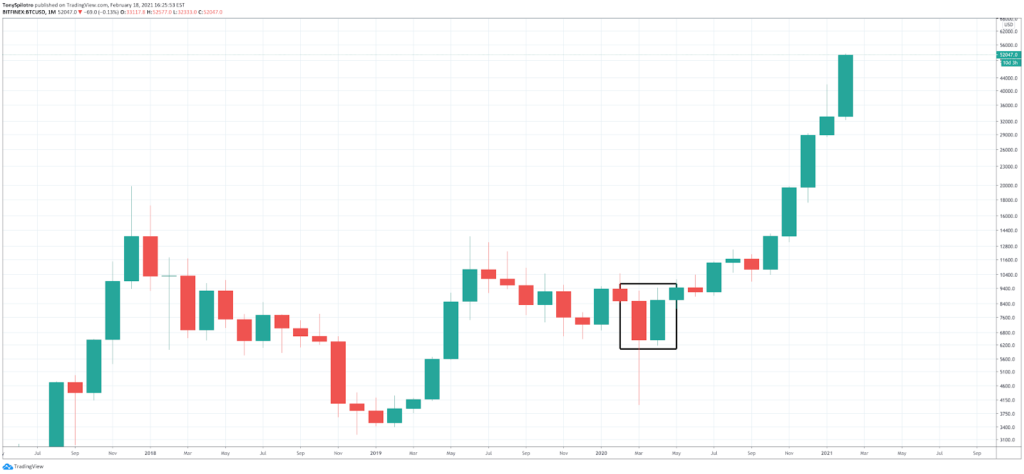
A bullish engulfing candle is a reversal pattern in which the entire green candle body fully engulfs the candle body of the previous candle.
This shows that selling was exhausted and buyers stepped in with even more strength, causing a trend reversal.
Notice in the example below, the bullish engulfing was a signal of the powerful upward trend to come.
Morning Star Candle Pattern
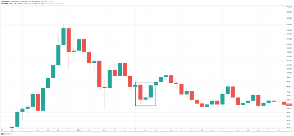
A morning star candle occurs when a doji appears at the bottom of a move, and is followed by an equally strong move upward. A doji is a candle with little to no body and very limited wicks or shadows.
This shows a strong move down by sellers, followed by a pause of indecision before the direction ultimately reverses.
Bearish Reversal Patterns
For each bullish reversal pattern there is a bearish counterpart. These patterns instead appear at the peak of moves before reversing back down.
Here are some of the most common and powerful bearish reversal patterns:
Shooting Star Candle Pattern
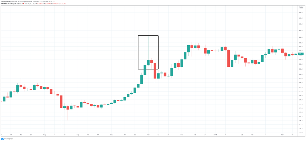
A shooting star candle pattern is essentially a candle with a long upper wick, and short candle body with little to no lower wick. It appears at the peak of an upward movement before price action turns down.
This type of candle represents a strong push by buyers that is met with strong resistance leaving a long wick behind in the wake.
Bearish Engulfing Candle Pattern
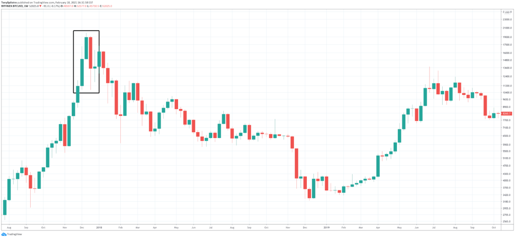
A bearish engulfing candle occurs when an entire green bullish candle body is fully engulfed by the following red candle body.
These can be extremely powerful bearish reversal signals and was the signal that kicked off Bitcoin’s last bear market lasting three years.
Evening Star Candle Pattern
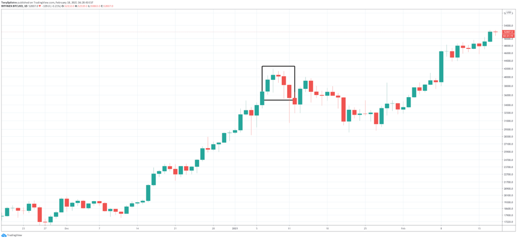
An evening star pattern takes place at the height of a bullish advance, and includes a doji, followed by a steep fall.
A doji, as a reminder, is a candle with little to no body and very limited wicks or shadows.
The Dow Theory
Dow theory is a well-known trading theory developed by Charles H. Dow. Dow, along with Edward Jones and Charles Bergstresser, founded Dow Jones & Company, Inc. The company launched the Dow Jones Industrial Average in 1896.
Charles Dow released the theory as a series of editorials but after he died in 1902, the complete theory was never published.
Dow theory concludes that the stock market is a reliable measure of overall business conditions within the global economy. When the conditions are conducive to a bull market for larger stock indices like the DJI, then there is a stronger likelihood that individual stocks benefit from the overall trend due to the market sentiment.
Dow theory was created for the stock market but the same theories and ideas apply to the crypto market. In cryptocurrencies, Bitcoin performing strongly also lifts altcoins like Ethereum and others.
The theory also says that the market prices in all available information including news, market prices, and market sentiment, and much more. The theory also suggests that trading volume should be increasing and the trend will persist until a clear reversal takes place.
The Market Has Three Types of Movements
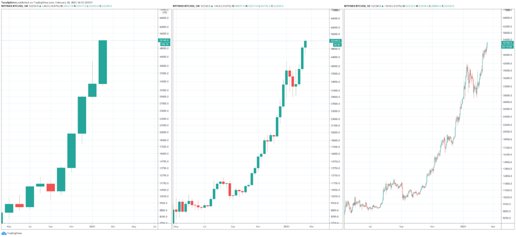
Markets, according to Dow theory, cycle through different types of trends. “Primary” trends last a year or more and are typically classified as bull or bear markets.
Within each primary trend, there’s also a “secondary” trend taking place across weeks to months. This price action is exhibited as a correction or consolidation.
“Minor trends last only days to weeks, and are mostly noise on the chart in terms of overall trends. The image below shows the same price action across primary, secondary, and minor trends respectively.
Market Trends Have Three Phases
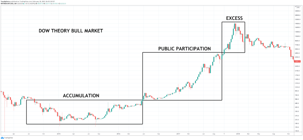
According to Dow theory markets can be bearish or bullish, and each type can have its own set of three distinct individual phases.
During a bull market, the first phase is the accumulation phase. After the asset is sufficiently accumulated and markup begins, the market moves into a public participation phase.
Once the public is fully invested, the excess phase occurs, and the bear market will begin in three of its own phases. The excess phase is perfectly demonstrated by the 2017 blow off top.
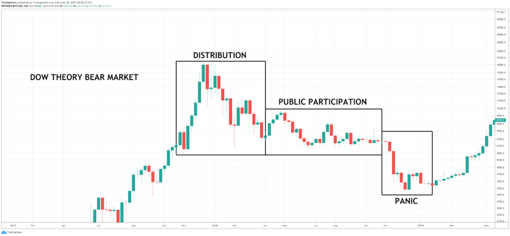
In a bear market, these phases are instead represented with the distribution phase, the public participation phase, and the panic phase. Bitcoin’s bear market bottom was the perfect example of panic.
What is Technical Analysis? The Key To Profitable Trading And Investing
Ever wonder how to read Binance charts? Technical analysis is the answer. Beyond simple or even advanced candlestick patterns on crypto charts, trend lines can be drawn across peaks and troughs or support and resistance to form shapes and patterns that can be used to predict price action.
Certain technical indicators and oscillators also exist that can provide traders with a unique read in certain market conditions such as momentum, volatility,volume, and more. Indicators appear below or layered over the trading activity on a Bitcoin price chart.
Time Frames for Reading Crypto Charts
Bitcoin trading analysis is broken down into intervals called timeframes. These timeframes vary from seconds to minutes, to hours, days, weeks, and months. The most common timeframes traders often watch to gauge the current trend and market activity are the 15-minute, hourly, 4-hour, 6-hour, and daily charts. Higher timeframes are more dominant in their signals, so weekly, monthly, and even yearly timeframes should also be considered for each coin, token, or crypto asset.
Day Trading
Day trading specifically looks at trading sessions lasting only a single day with all trades opened and closed within the daily timeframe. Traders who use this approach focus more on smaller timeframes and take shorter, “scalp” trades regardless of price level.
Swing Trading
Swing trading entails holding a trade for a specific amount of time, typically weeks or months. Traders wait for the ideal price change they are looking for, or close after reaching a clear resistance or support level.
Chart Patterns
An important factor in how to analyze cryptocurrency price movements involves drawing trendlines across various crypto chart patterns to form shapes such as triangles or wedges.
When a visible trend line with multiple touches has been established, closing price outside the trend line will confirm the pattern as valid. Chart patterns can help predict future price action, and is a critical cornerstone of technical analysis crypto trading.
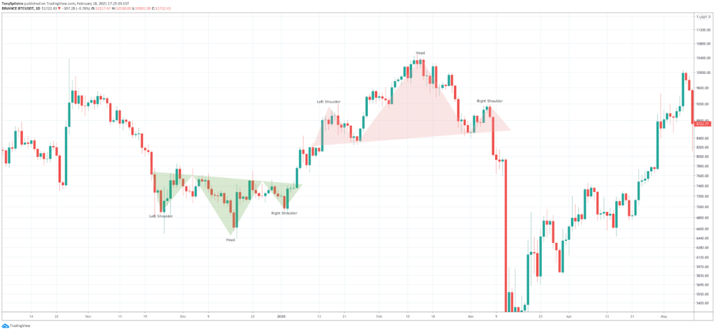
Head and Shoulders
Head and shoulders are reversal patterns and can appear at the bottom or top of a trend. When they appear at the bottom of a trend, they are called an inverse head and shoulders.
These patterns represent a visible tug of war happening between buyers and sellers, with one side eventually overwhelming the other, and causing a bigger push or pullback as a result.
Triangles
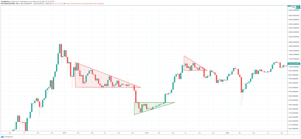
Triangles are increasingly tightening shapes that feature a sloped top or bottom trendline. When the opposing trendline is flat, the pattern is an ascending or descending triangle, as pictured below. Two converging sloped lines forms a symmetrical triangle, not pictured here.
Wedges
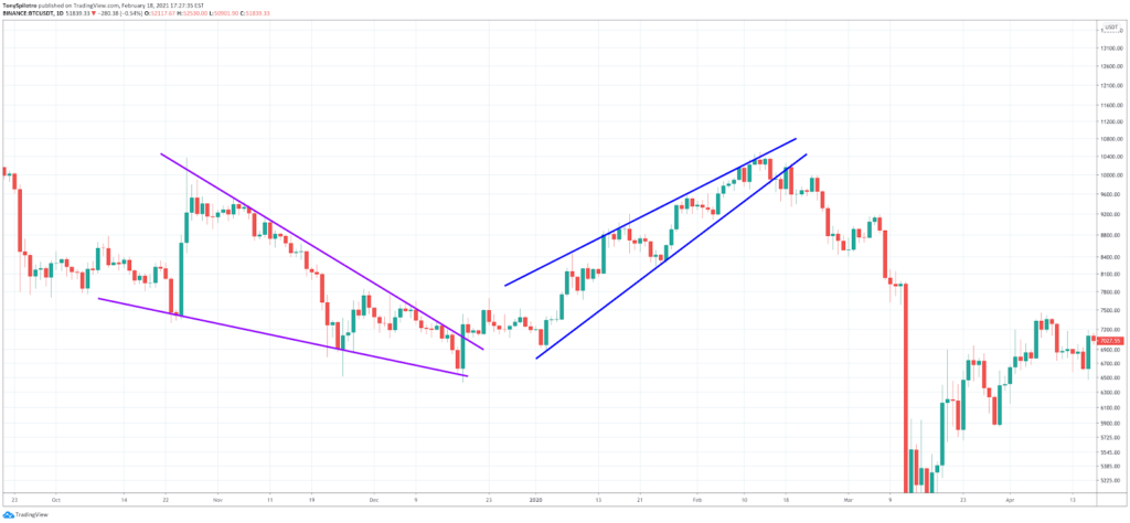
Wedges show a trend running out of steam in action, ultimately leading to a breakdown or breakout in the opposite direction of the prevailing trend. Sideways markets tend to wedge back and forth until a direction is chosen.
Support and Resistance
Support and resistance levels are among the most critical pieces of reading any cryptocurrency price chart, and crucial to technical analysis.
Types of Support and Resistance
Support and resistance levels can be horizontal, diagonal, rising, descending, or even psychological levels. For example, $10,000 was a physiological resistance level during the bear market, while downtrend diagonal resistance pushed Bitcoin through the support line eventually.
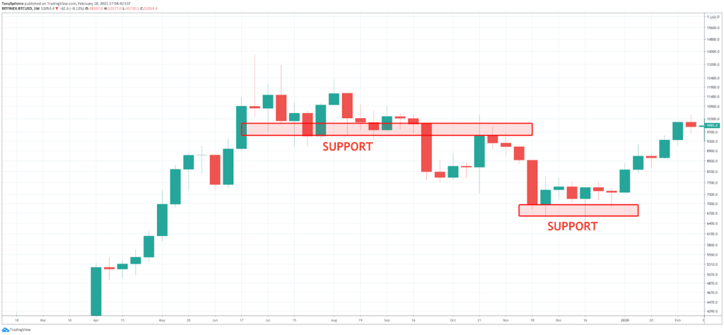
Support
Support levels are areas where orders exist on exchange and could result in buy orders triggering with enough strength to cause a reversal.
Support levels exist where price action took place before, such as former resistance. Support levels can fail, ultimately establishing support even lower, as pictured below.
Resistance
Resistance works similar to support, but instead prevents price action from moving higher instead of lower. Sell orders are responsible for resistance areas.
As pictured in the example below, once price passes through resistance (or support), it often comes back to retest and confirm resistance as support or vice versa.
Technical Indicators
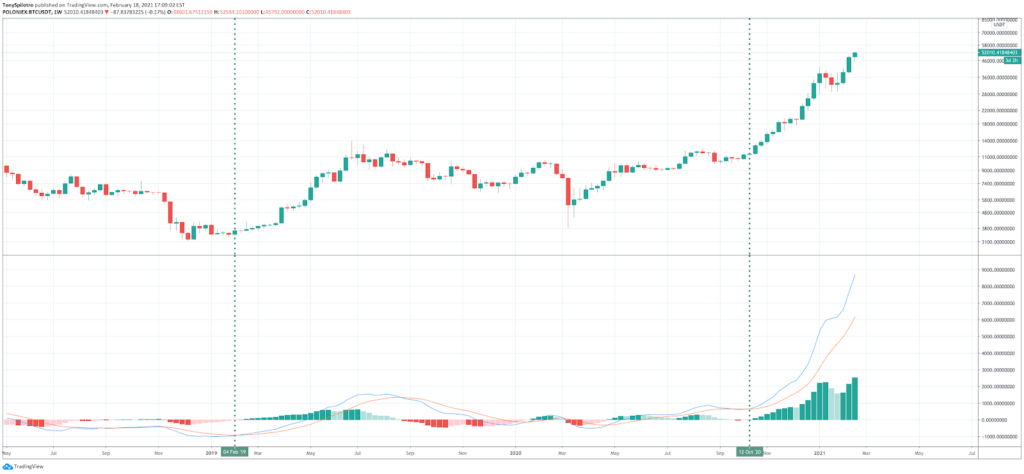
Technical indicators are technical analysis tools designed to provide additional information and data about the market activity and underlying price action. For example, the MACD focuses on momentum and trend changes, while the RSI lets traders know when an asset is overbought or oversold. Combined with price patterns and crypto candlestick charts, can be extremely effective and profitable.
Moving Average Convergence Divergence (MACD)
MACD stands for the Moving Average Convergence Divergence and is often considered a lagging indicator. The MACD uses two moving averages that converge and diverge to signal when an asset is overbought and oversold. The two lines also represent momentum, and when they cross over or under, it can be a signal that the trend has changed.
Relative Strength Index (RSI)
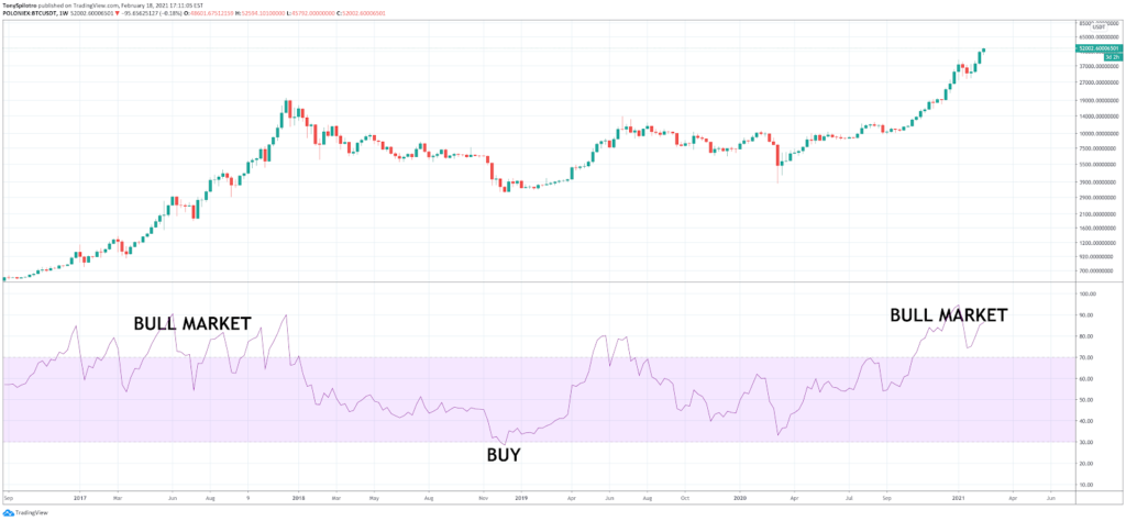
The RSI also called the Relative Strength Index is a trend strength measuring indicator that also says when an asset is overbought or oversold. Because Bitcoin behaves unlike other assets, the RSI responds differently.
The RSI usually signals when an asset is about to correct, but in Bitcoin, the asset can stay overbought for extended periods, and is instead considered the bull market zone on higher timeframes, as pictured below.
Bollinger Bands
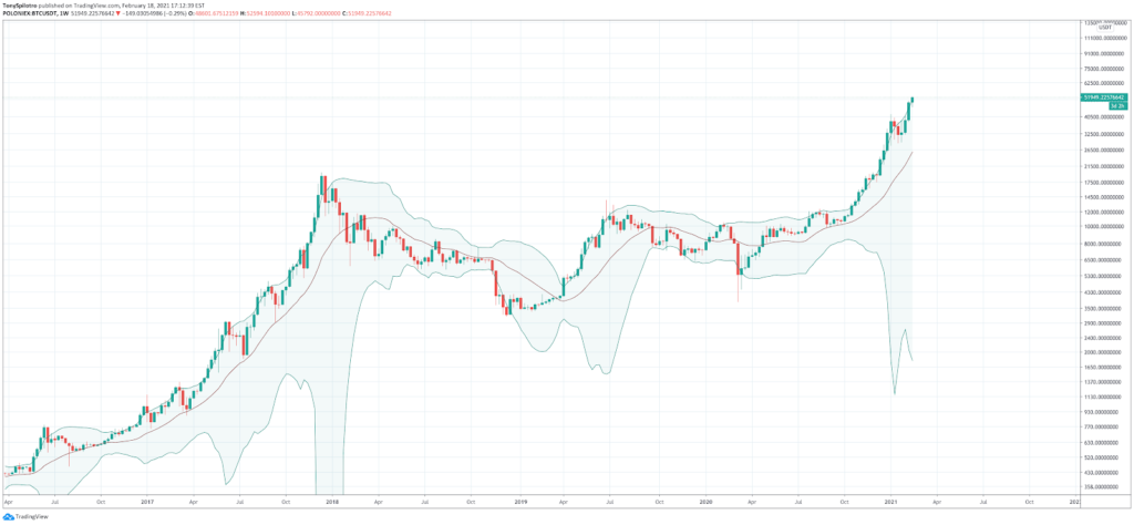
The Bollinger Bands are a moving average and two standard deviations of the moving average, used to chart volatility in a crypto asset.
Price passing through the middle-BB is a powerful buy or sell signal. Price action closing outside of the bands either results in “riding the bands” or a reversal. The middle-BB was where Bitcoin corrected to during the last bull market, and can provide clues where to buy the dip.
If Bitcoin price passes through the middle-BB, a new bear market could be beginning.
Fibonacci Retacement and Extension Levels
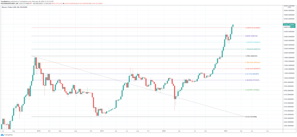
Fibonacci retracement and extension levels are key mathematical ratios based on the Fibonacci sequence.
Popular levels to look for are 0.618 or 0.5 retracement levels, or 1.618, 2.618, and higher for Fib extensions.
Why these levels act as support and resistance aren’t fully understood, but these ratios are found everywhere in nature and extremely powerful.
Cryptocurrency Market Cap: The Most Important Chart In Crypto
The cryptocurrency market cap is an aggregate view of the entire digital asset space across all cryptocurrency trading platforms and the assets they offer. Aside from charting Bitcoin itself, it is the king of cryptocurrency technical analysis charts as it is a snapshot of the health of the entire cryptocurrency market.
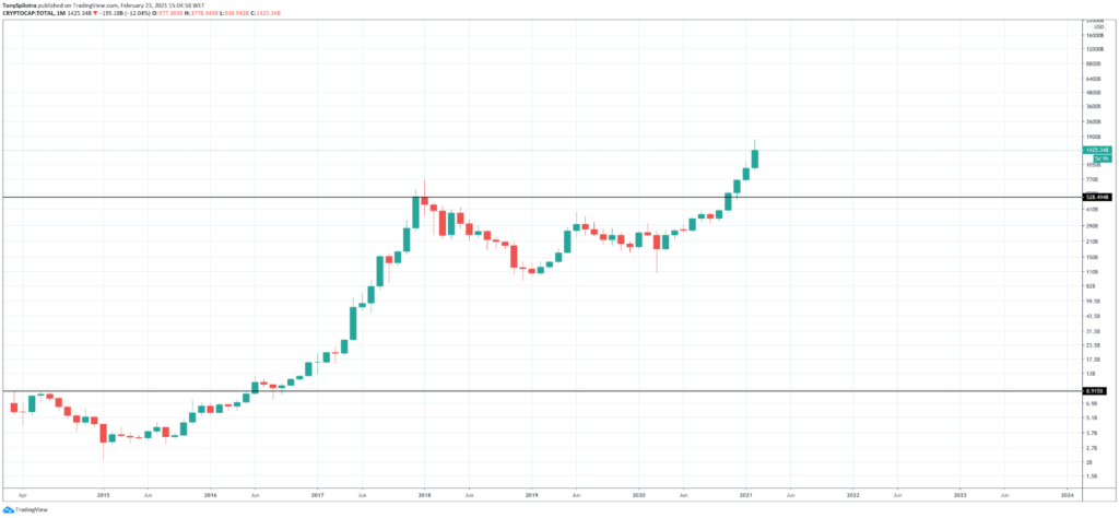
Bitcoin takes up the lion’s share of the market size, with Ethereum right behind it. The top ten cryptocurrencies by market cap are some of the most respected and valuable cryptocurrencies, but the list is always changing.
According to nothing more than a major resistance line, the total crypto market cap appears to be repeating the previous cycle’s move. Based on the measure rule, the total crypto market should rise by a similar height and trajectory. If that’s the case, the total crypto market cap will be worth trillions of dollars, with Bitcoin nearing $10 trillion alone in the next five years.
Summary: Understanding Cryptocurrency Charts
Learning how to read Bitcoin charts is the same as learning how to read crypto charts in general. If you are trying to read crypto price charts from any platform at all, for example, reading binance charts, it all comes down to the same factors, such as candlesticks, chart patterns, and technical analysis indicators.
Recapping How To Read Candlestick Charts Crypto And Other Cryptocurrency Price Charts
This guide has went into great detail on how to read candlestick crypto charts and gone over all of the basics of crypto chart analysis.
Japanese candlesticks provide important market data about each trading session open, close, high, and low, which traders can use to analyze and discover chart patterns. Understanding cryptocurrency charts can be highly profitable, as it allows traders and investors to predict future outcomes of markets or when trend reversals might arrive. Combining candlesticks with trendlines and technical indicators is the key to profitable technical analysis.
Conclusion: How To Put Your Crypto Chart Reading Skills To The Test
Now that you have a strong understanding of how to read Bitcoin charts, you can put your skills to the test trading on the award winning platform Exnes Market View.
Exnes Market View is available to anyone to register for a free account and deposit BTC to a secure wallet to get started trading. Deposits are made in BTC rather than more complicated methods like a wire transfer. The trading experience includes built in charting software and technical analysis tools to assist with getting a good read on where market price is going.
Exnes Market View doesn’t just offer Bitcoin and crypto but as many as 50 assets total across forex, commodities, stock indices, and more. Access all of these assets and more right from your fingertips from a free mobile app for Android and Apple smartphones.
How Do You Predict Cryptocurrency Charts?
Making predictions using crypto charts involves technical analysis, and analyzing patterns across price action and candlesticks. Using the available information and technical indicators, traders can make informed guesses with probabilities in their favor.
Why Do All Crypto Charts Look The Same?
That’s because as explained in the Binance versus Poloniex example above, all charts are exactly the same because the base trading pairs are the same across any platform. For example, BTCUSD is Bitcoin trading against the dollar. And while there are some price fluctuations between platforms, the charts themselves are the same.
Why Do Crypto Prices Move Together?
As part of Dow theory, the idea is that market sentiment overall begins to spill over into smaller coins from Bitcoin and Ethereum. This happens both due to increased risk appetite and more profits to go around.
How Do You Know If Your Cryptocurrency Is Up?
It is important to know your buy in price clearly to understand when the investment has increased beyond that. Using portfolio tracking apps can be helpful in keeping tabs on holdings and its performance.
What Causes Crypto Currencies To Fluctuate?
Crypto assets are speculative assets so they are more susceptible to price movements. These price movements occur due to news, regulation, or just through regular market trends.
What Determines Crypto Price?
The free and open market dictates the price of all crypto assets, but there are technical and fundamental reasons for why prices can change. For example, if an asset is extremely oversold, it could increase just due to the fact a short term relief bounce is needed.
Is It Smart To Invest In Bitcoin Right Now?
Yes. Investing in Bitcoin has never been a bad idea. Even when investors have bought the top in Bitcoin, holding long enough always results in more upside. Bitcoin is a revolutionary technology and even though the cryptocurrency has been around for ten years and now trades at $50,000 a coin, it is still very early for Bitcoin investors.
Is It Smart To Invest In Other Cryptocurrencies Right Now?
The chart of the total cryptocurrency market cap looks primed for a major breakout, so altcoins could soon soar. However, it is wise as a crypto investor to hold primarily BTC, and only a smaller portion of altcoins.
