Investors know a great deal about these stock indexes, but traders pay closer attention to the intricacies of each of the major stock indices to take advantage of the variety in the ebbs and flows of each market and the individual stocks that make up each benchmark index.
Just about everyone in the United States at one point or another has heard of the Dow Jones Industrial Average, NASDAQ, and the S&P 500 – possibly from watching the news or reading the newspaper – but few know the definition of what they truly are.
Other stock market indexes exist across the globe representing companies from different regions and specific market sectors, however, these three – the Dow Jones Industrial Average, NASDAQ, and the S&P 500 – are the most popular US indexes, and are often a barometer of the overall US economy and the country’s overall financial health.
When the county is thriving, so are its stock markets and equities. Given the country’s position of financial power and leadership position due to the US dollar being the cornerstone of the global economy and global reserve currency, these markets have been profitable for investors and traders for many years and decades.
Recently, with a recession looming, these markets have experienced large crashes followed by record-breaking rallies. The explosive volatility has made these markets especially appealing for traders of all types.
Even crypto traders are more often trying to trade traditional assets like stock market indices like the S&P 500, NASDAQ, or the Dow Jones. They’ve begun to ditch the high risk assets in favor of trading traditional markets.
For those that do not know these stock indices inside and out, we’ve created this in-depth guide explaining the key differences between each along with their various components and what it all means. When you’re done reading this guide, the next time someone asks you what is Dow Jones and NASDAQ, you can answer them correctly with confidence.

NASDAQ Overview
The NASDAQ – not to be confused with the Nasdaq stock exchange itself – is a United States-based stock market index consisting of 100 of the largest tech companies listed on the Nasdaq stock exchange, and is often traded under the NDX ticker.
What does NASDAQ stand for?
NASDAQ is an acronym for the National Association of Securities Dealers Automated Quotations, founded in 1971 by the National Association of Securities Dealers, today commonly known as the Financial Industry Regulatory Authority.
Dow Jones Overview
The Dow Jones Industrial Average is a major American stock market index that measures the performance of 30 of the largest companies listed on stock exchanges across the United States. Unlike other stock indices, the Dow Jones only includes 30 large-cap companies, it isn’t weighted by market cap, nor does it use a weighted arithmetic mean.
What does Dow stand for?
The Dow is short for Dow Jones Industrial Average, named after and created by The Wall Street Journal editor and Dow Jones & Company co-founder Charles Dow.
S&P 500 Overview
The S&P 500, or often referred to as just S&P, is another major stock market index, measuring the performance of 500 of the largest companies listed across United States stock exchanges. Because it features such a large sample of American companies, it is often used as a barometer for gauging the strength of the United States economy.
What Does S&P Stand For?
Standard Statistics Company created the first United States stock market index. Later, the company merged with Poor’s Publishing, renaming the company to Standard & Poor’s – representing the S&P.
Down the line, the index was expanded to include 500 companies, adding the 500 to the S&P 500 name. It has traded under that name ever since, although the companies included often change.

How Are the Dow Jones, NASDAQ, and S&P 500 Calculated?
Each major stock index features some sort of weighting mechanism, typically by market capitalization. Weightings prevent one company’s performance from negatively impacting the rest of the index. However, one of the main differences between Dow Jones and NASDAQ is the fact that the Dow doesn’t account for changes in market cap as other indices do.
NASDAQ Calculation
The NASDAQ-100 Index is a market capitalization-weighted index. The value of the NASDAQ average equals the total aggregate value of the Index share weights multiplied by each security’s last price, then divided by the divisor of the Index.
The formula for calculating the index is NASDAQ-100 Index = Aggregate Adjusted Market Value / Divisor
The formula for the divisor is (Market Value after Adjustments / Market Value before Adjustments) x Divisor before Adjustments
Dow Jones Calculation
The Dow Jones Industrial Average is calculated by adding up all the individual Index share weight prices of its 30 components and dividing the sum by the divisor. However, the divisor is regularly adjusted for due to corporate stock splits or dividend payouts.
S&P 500 Calculation
Calculating the value of the S&P 500 index involves finding the sum of the adjusted market cap of all included stocks, divided by a factor called a Divisor. The Divisor’s value is considered to be proprietary but is roughly 8.9 billion.
The formula for the calculation is S&P 500 Index = All S&P 500 Stocks / Divisor
Major Differences Between Dow, NASDAQ and S&P 500
The below table will easily show some of the main differences between NASDAQ vs Dow Jones
S&P 500 vs Dow Jones, or NASDAQ vs S&P 500.
| NASDAQ | DJIA | S&P 500 | |
| Definition | Tech-focused US stock market index of companies traded on the Nasdaq stock exchange. | 30 of the largest companies traded on US stock exchanges. | 500 of the largest companies traded on the US stock exchange, using a weighted formula. |
| Abbreviation | National Association of Securities Dealers Automated Quotients | Dow Jones Industrial Average | Standard and Poor’s 500 |
| # of Companies | 100 | 30 | 500 |
| All-Time High | 9,718 | 29,551 | 3,386 |
| Exnes Market View Symbol | USTECH100 | WALLSTREET30 | SP500 |
Volatility Differences
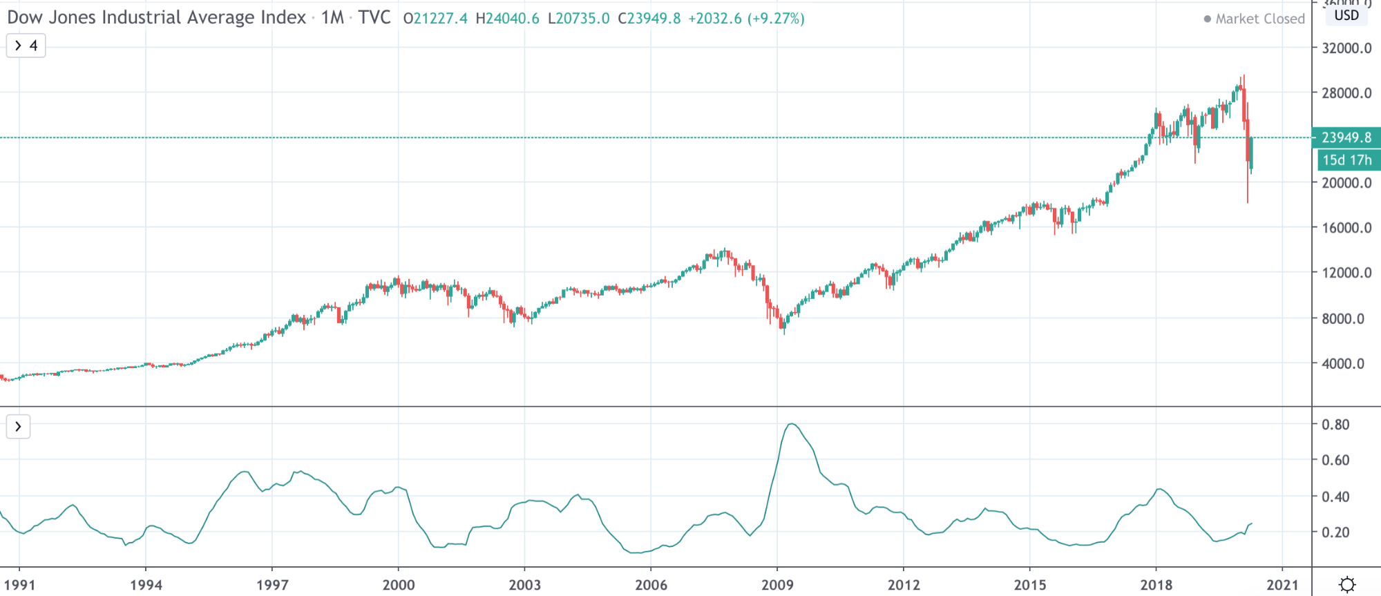
Diving even deeper into the differences between each of these indices, we’ll compare the volatility in price action by using the Bollinger Band Width.
S&P 500 vs Dow Jones
As you can see in the charts below, the two charts are very similar, due to the 30 companies featured in the Dow Jones also being included in the S&P 500, and due to them all relying on the American economy thriving for growth.
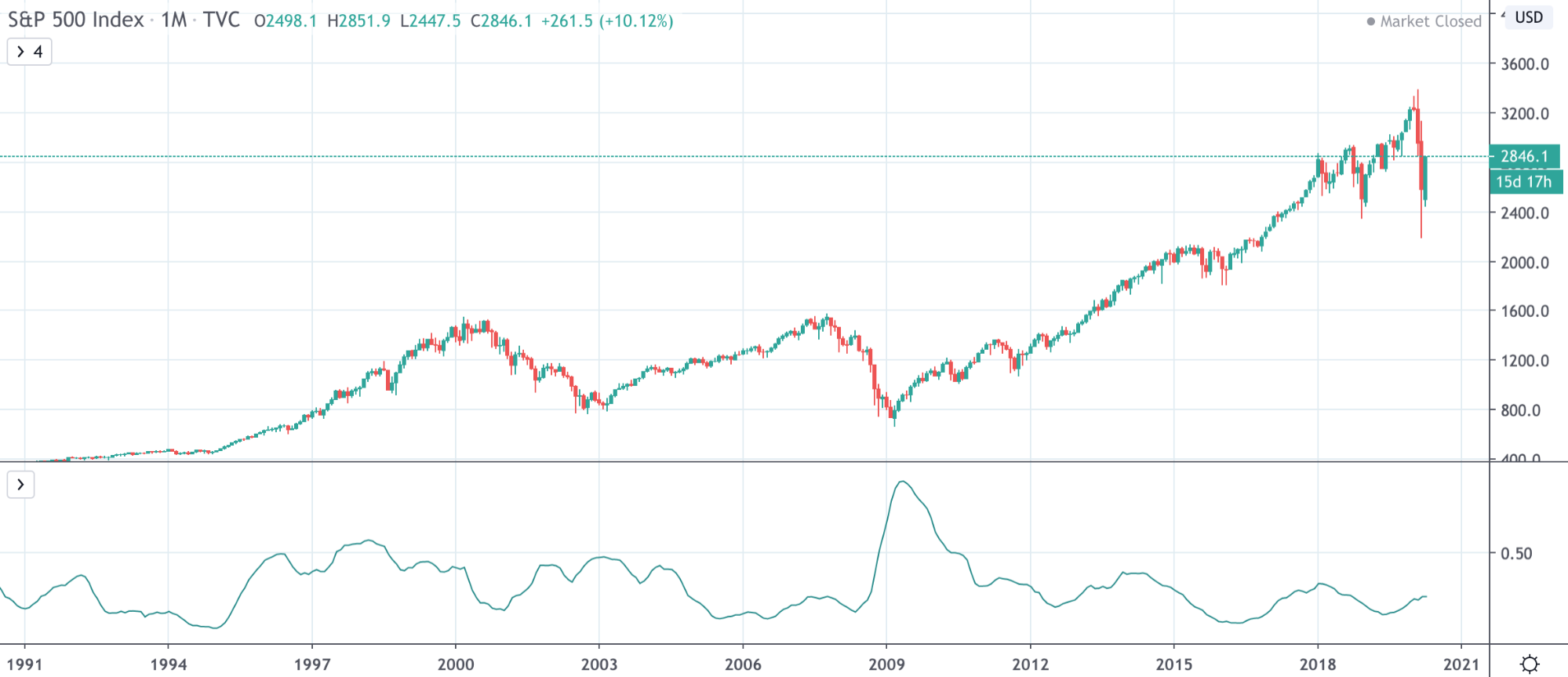
The S&P 500 had a larger rise in the early 90s, due to more tech companies making the list during the booming economy.
NASDAQ vs S&P 500
Here, the charts look a lot more unique, especially in the early 90s as the dot com tech bubble took off.
In the early 90s, the NASDAQ outperformed the S&P 500 during the dot com bubble. NASDAQ is composed of major tech companies like Microsoft, Apple, and many others, giving the index.

The S&P 500 also saw stronger growth in the 2000s, just before the great recession caused each market to collapse – similar to the selloff we’re seeing lately.

NASDAQ vs Dow Jones
Again, these charts look different due to the NASDAQ reflecting the early 90s dot com boom, which is barely a blip on the Dow by comparison.
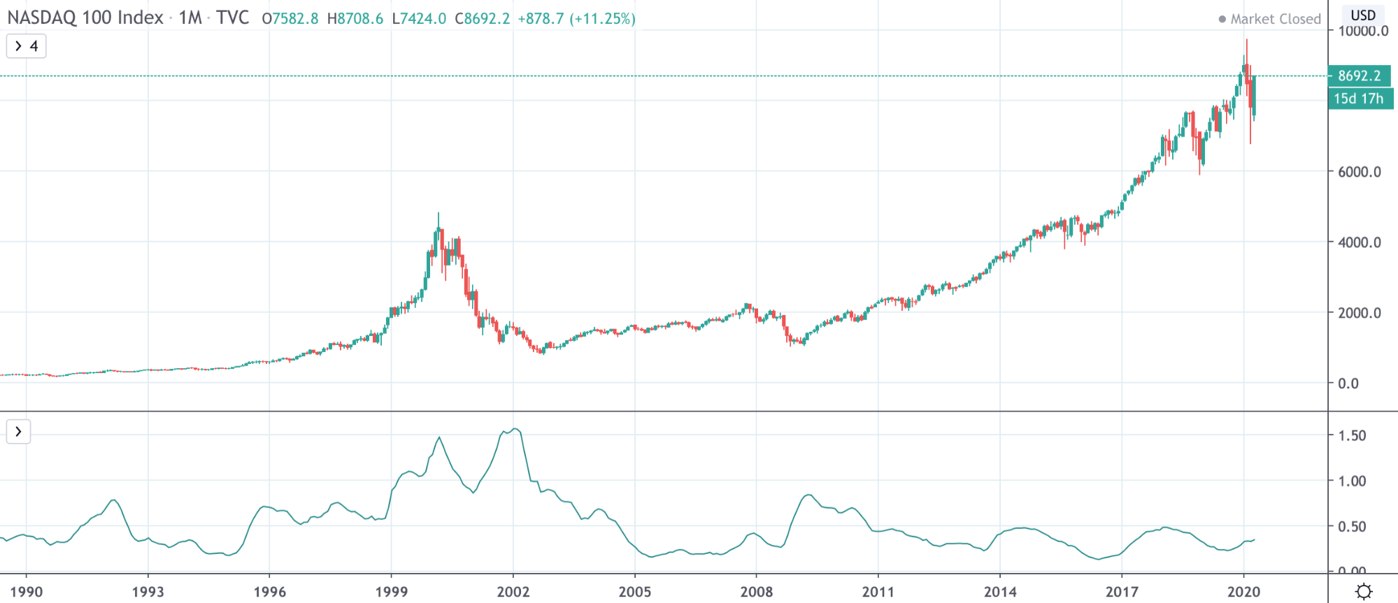
After that divergence, however, the indexes had relatively similar performance leading into the recession, then in the years following it.

Trading Difference Between Dow Jones, S&P 500 and NASDAQ
Although there are similarities between each asset’s price charts due them all being related to the US economy, because there is a difference in the volatility between each of the major US stock indices, there are also nuances that vary across each index when considering a trading strategy. We’ve outlined some examples of the trading differences between the Dow Jones, S&P 500 and NASDAQ.
Candlestick Trading Differences
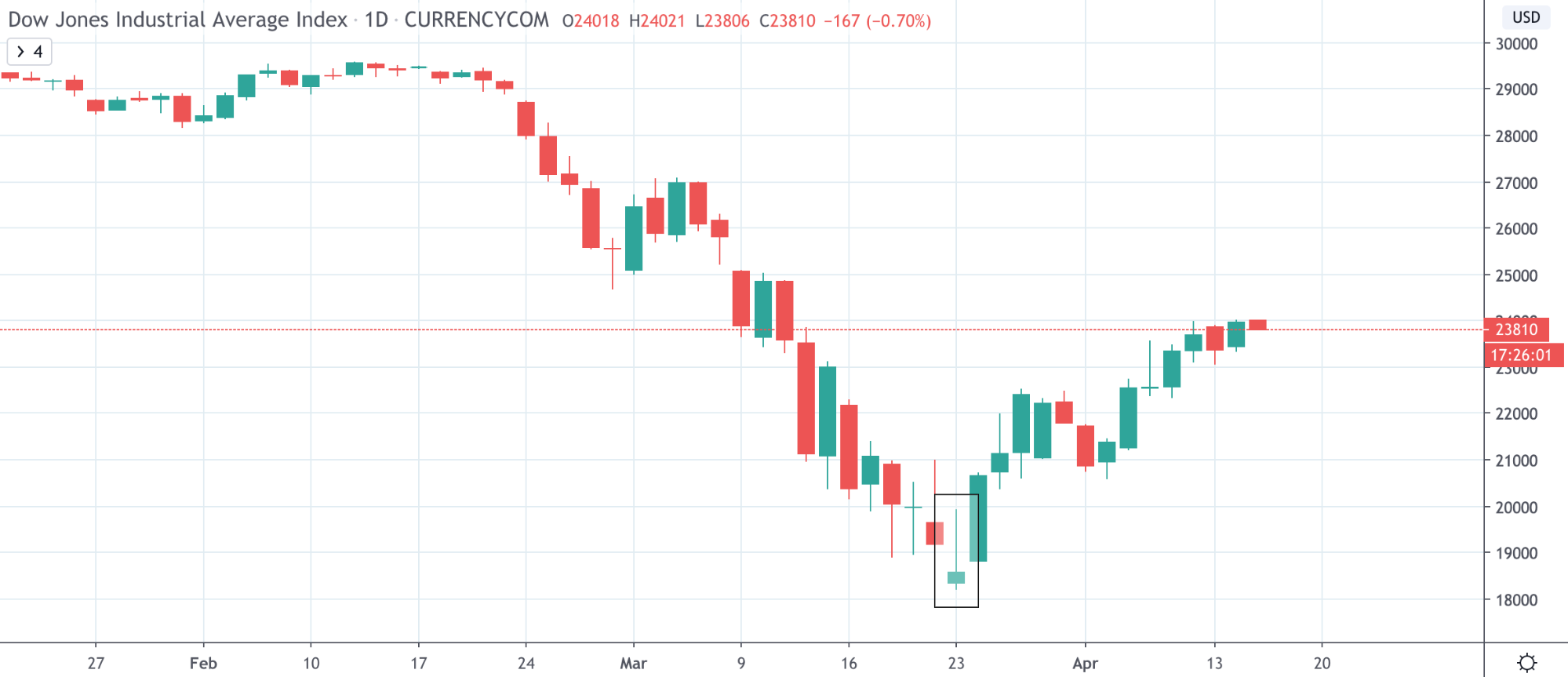
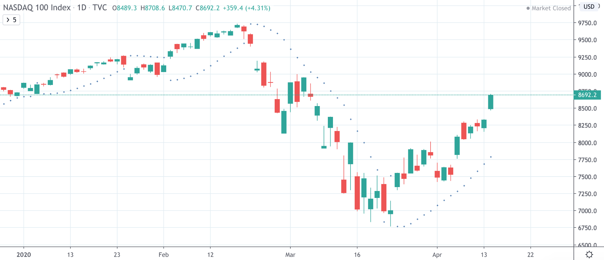
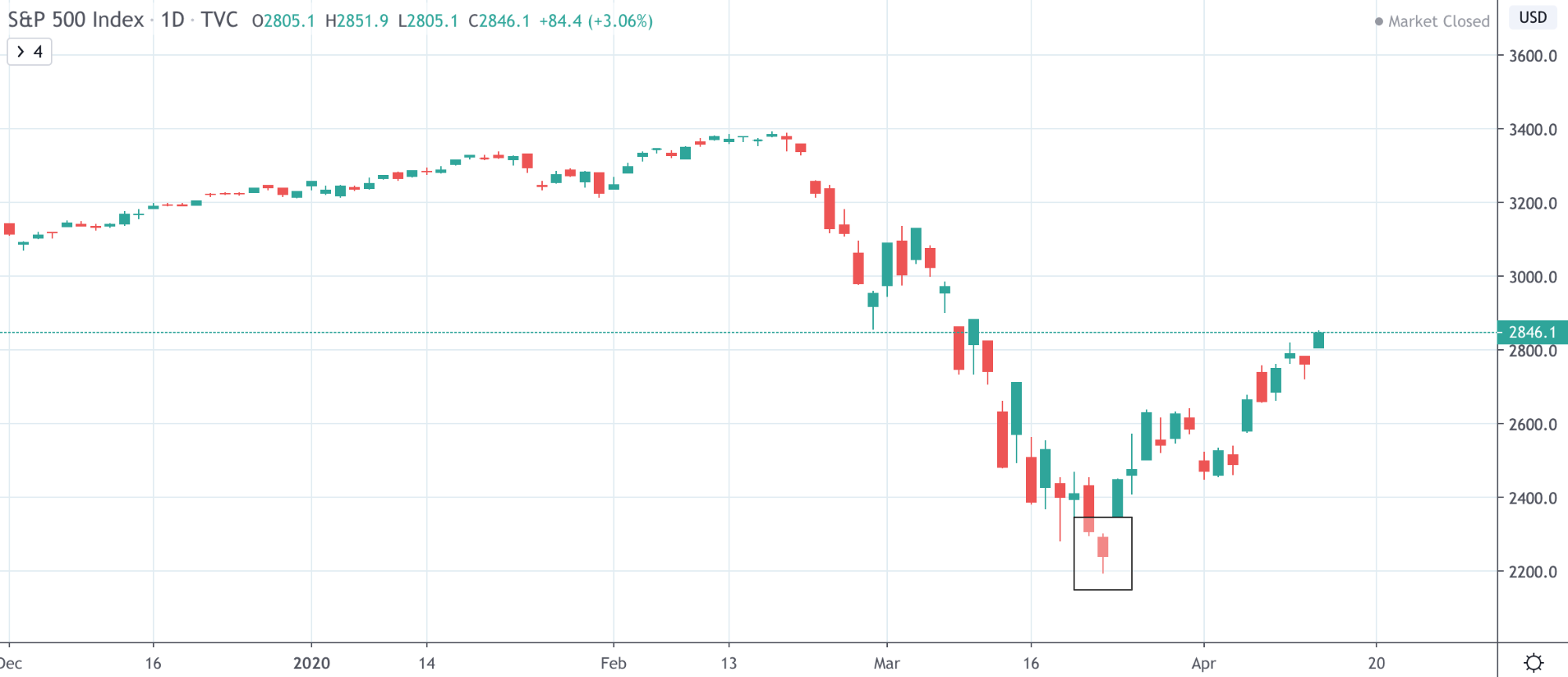
In the three charts below, each bottom was marked by a different Japanese candlestick formation.
The Dow Jones closed at the bottom with an inverted hammer – typically a bullish reversal signal.
NASDAQ formed a green doji candle with equal shadows on either end, showing indecision, but ultimately bulls took over.
The S&P 500 had a red doji candle, resembling a hammer, but it isn’t the clearest formation regardless of what it ultimately is.
Relative Strength Index Trading Differences
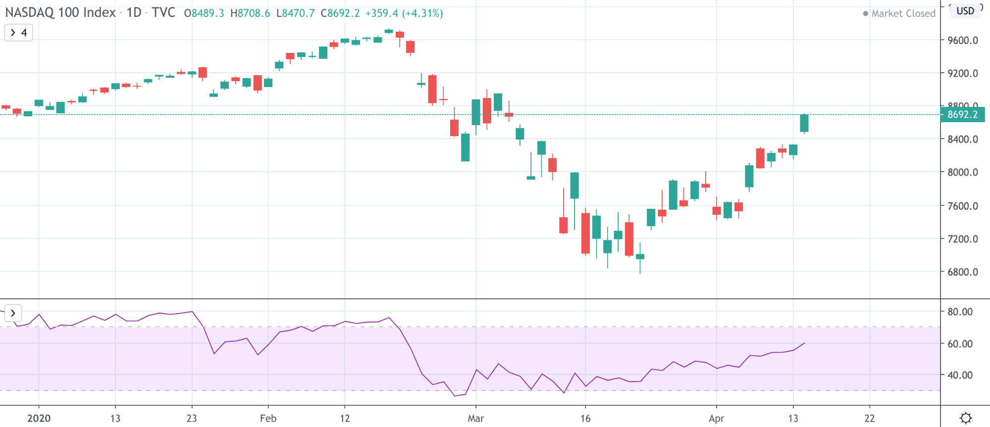
Below, comparing the three charts you can see how a trading strategy involving the RSI would need to be different across each stock index.
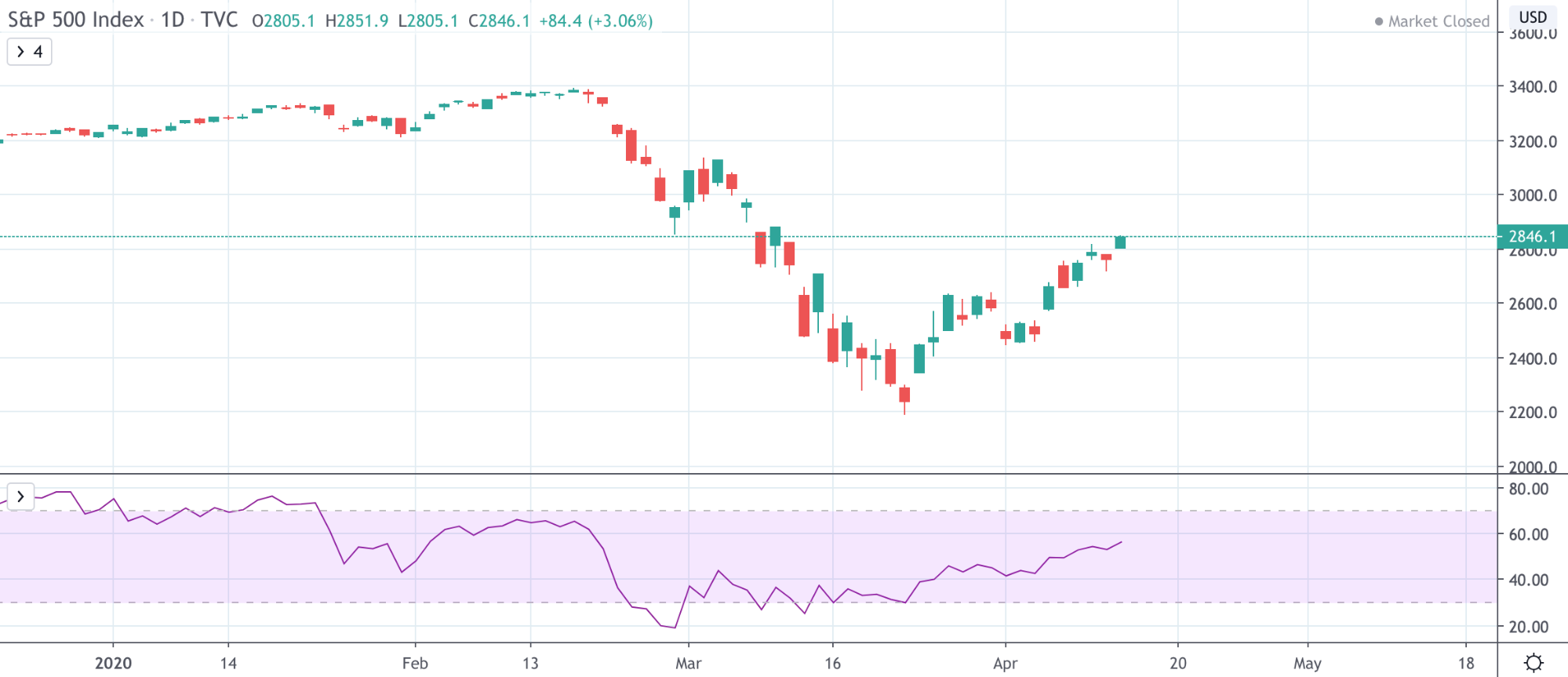
The RSI on both the Dow Jones and S&P 500 look strikingly similar, due to the indexes featuring similar companies.
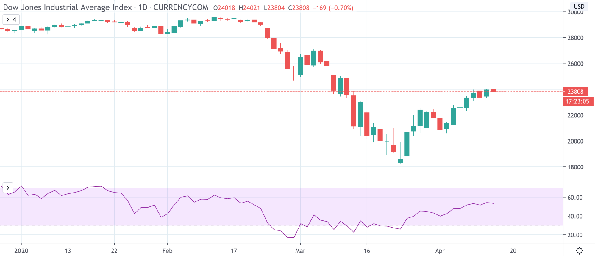
Unlike these other two stock indices, the NASDAQ Relative Strength Index spiked above 70 again just before the major collapse occurred.
Bollinger Bands Trading Differences
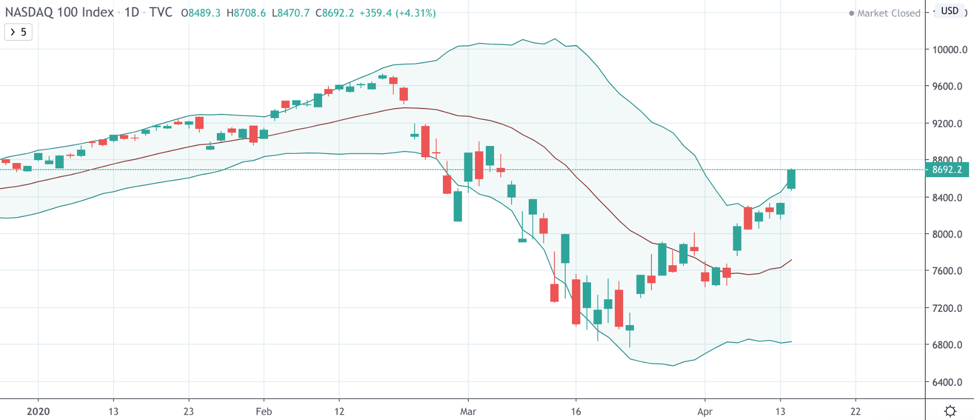
Using the Bollinger Bands, even more differences can be spotted, such as when each asset passes through the midline, and if they’ve touched the bottom or top of the bands, or perhaps broken outside of them.
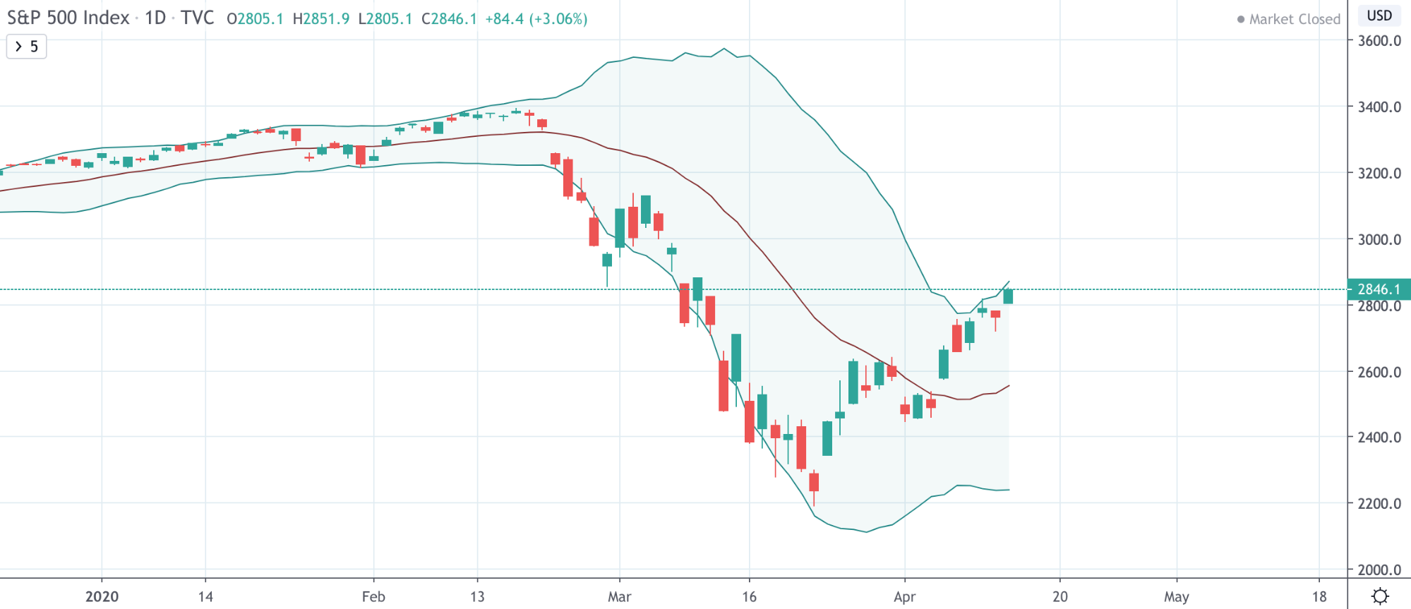
Notice how the Dow Jones below doesn’t touch the upper band, showing that it is the least bullish of the bunch.
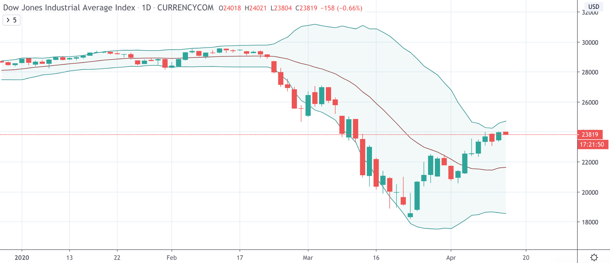
The NASDAQ charts show just how much more bullish tech stocks specifically were after rebounding from the latest crash. Notice how the NASDAQ chart the price candle reaches outside of the top band.
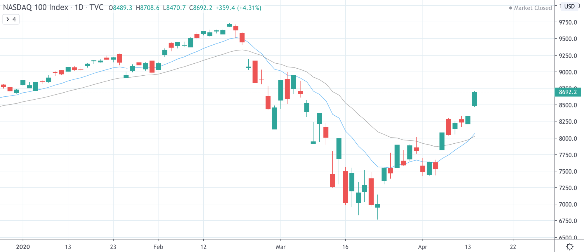
Moving Average Trading Differences
In the below, the examples of moving averages also show how much more bullish NASDAQ is during the recent rebound versus the rest of the stock indices.
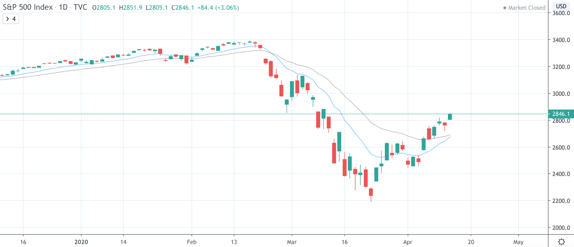
The S&P 500 is slightly less bullish, similar to the Bollinger Bands images depicted above.
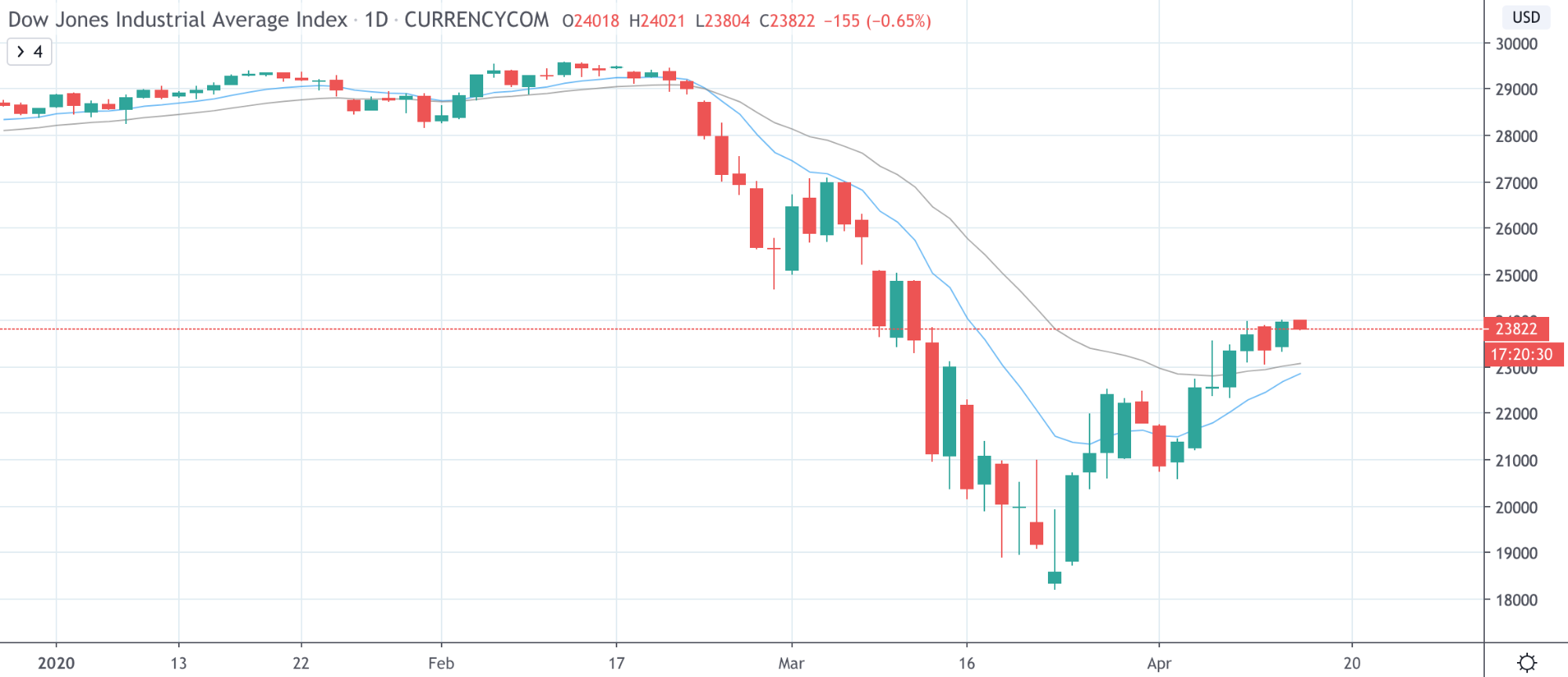
The least bullish is the Dow, again, matching the Bollinger Bands and other indicators. These minor differences can mean a lot to traders in terms of signals and profits.
Parabolic SAR Trading Differences
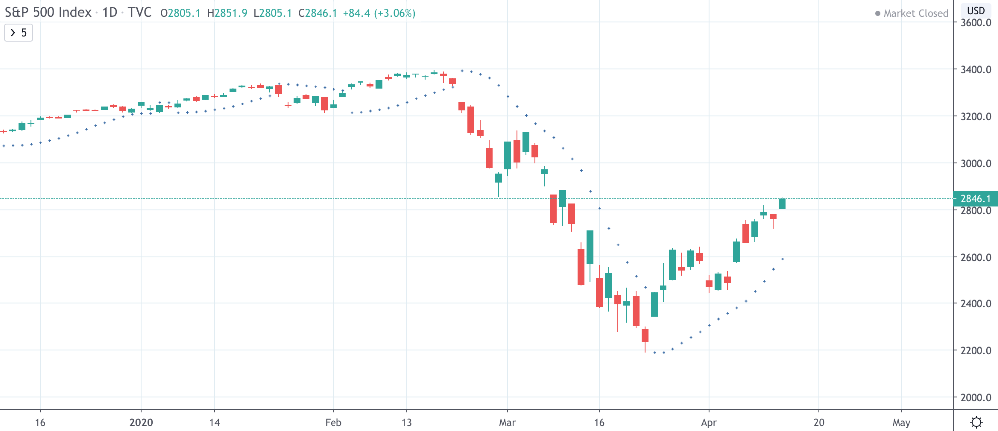
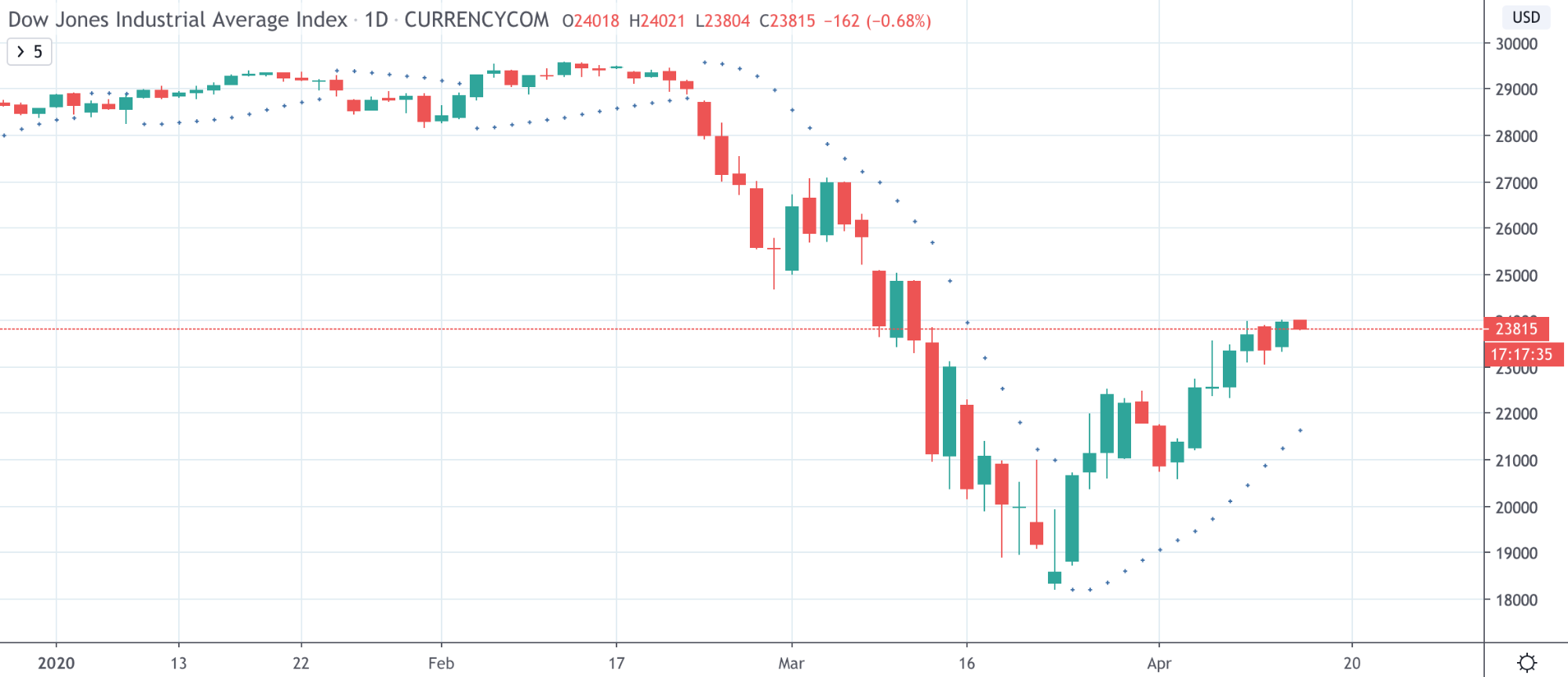
In the three below examples, pay close attention to how the Parabolic SAR dots appear below and then above rapidly in succession at the bottom of the recent NASDAQ crash, however, this doesn’t appear elsewhere.
The added volatility in NASDAQ can be seen in the way the Parabolic SAR behaves in such a manner.

Notice how this doesn’t occur on the S&P 500, and instead, the SAR simply switches sides just once.
Nor does this pattern appear on the Dow Jones, only one change in the side the SAR appears on occurs.
Bonus Tips for Traders: Dow Jones, S&P 500, and NASDAQ
Knowing which companies are included within each major stock index can help traders to understand how market conditions may impact the underlying index shares. For example, during the dot com bubble, the NASDAQ greatly outperformed the rest of the US market, due to the FOMO effect of investors feverishly buying up tech stocks.
Paying close attention to breaking news, political moments, or other events like natural disasters that could impact the economy or stock market can tip traders off early before the herd mentality kicks in and panic sells.
Stock indices can be part of a well-diversified trading portfolio consisting of other uncorrelated and anti-correlated assets, such as commodities, cryptocurrencies, forex, and more.
Traditional markets are more volatile than ever right now, as the market attempts to price in a recession and global pandemic. It’s made these markets more profitable than ever, causing even cryptocurrency traders to consider trading traditional assets like forex, stock indices, commodities, and more.
Trade Stock Indices Like Dow, NASDAQ, and S&P 500 on Exnes Market View!
Now that you know all there is to know about each of these three major US stock indices, and with the key differences between them explained, it’s now time for you to open up a trading chart yourself, and try trading the Dow Jones, S&P 500, and NASDAQ on Exnes Market View.
The advanced trading platform features CFDs for each major stock index, represented as the Wall Street 30, USTech100, and SP500, and are available for trading with up to 100x leverage.
With how volatile these markets have been in 2020, there have never been more opportunities for profit – once in a lifetime opportunities that absolutely should not be left on the table.
When the stock market is crashing, shorting these stock market indices can bring traders enormous profits, rather than holding through the storm at a loss as an investor.
Why watch paper gains disappear. Traders can instead turn falling prices into profits, then when the market turns around, long positions can ride the recovery post-recession.
The advanced trading platform features the top tools of the trade that professionals expect, all within a customizable user interface that even novices will find easy to use.
Risk management tools are also included, as well as built-in charting software, letting traders place orders directly from the price chart itself.
Lucrative referral programs round out the platform’s many benefits, offering traders yet another way to grow their income, alongside their trading activities.
